E-RESPECT
Designing an online magazine
The Toulouse School of Medicine asked G-Design to technically steer the digital scientific magazine for students named e-respect.
Milestones of the e-respect project
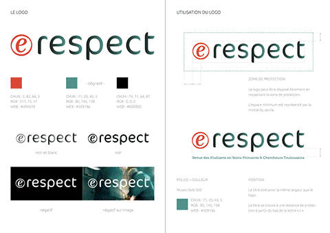
1. Logo
After reviewing visual elements used by other health magazines, G-Design ended up with three unique logo proposals which comply with the technical requirements and the editorial policy frameworks. Out of these three options, the client chose the closest matching style to what he was having in mind for the magazine.
2. Style guide
After deciding on the logo, G-Design developed e-respect whole visual identity. Working with mood boards allowed the client to give his feedback at this step of the process. The result is a coherent style guide with selected color codes, typography and layout.
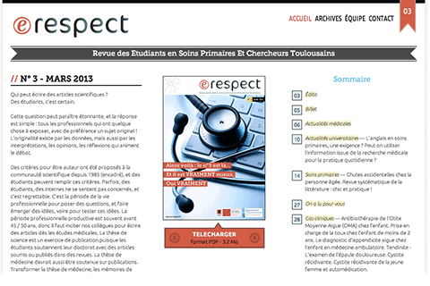
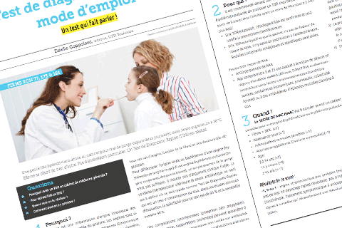
3. Designing the magazine and website layouts
From there, G-Design worked simultaneously on:
- building the design layout of the magazine’s first issue as a downloadable PDF file.
- designing and developing the responsive website to present the magazine, publish it online and make it easily cross-platform readable (laptop, tablet, smartphone…).
« Attentiveness and availability of a single contact person. These are the main advantages of collaborating with Gunther Groenewege. I really hope to keep working with him! »
— Stéphane Oustric, Professor at Toulouse School of Medicine
4. Follow-up
E-respect website was published when the magazine’s first issue came out in March 2012. Since then, G-Design has been following up the project and creating the design for each issue of the magazine.
Mobility at the heart of the project
With a responsive web design, the page layout automatically adapts to fit the screen size of the device used for reading the magazine. The viewing experience is therefore optimized for all platforms.
RESPONSIVE DESIGN
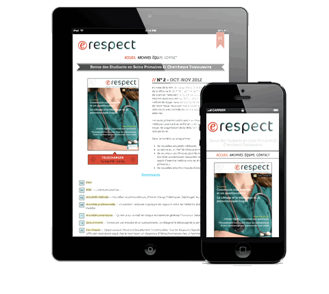
At the beginning, the contracting party had thought of a solution much like « a leaf-through magazine » using Flash technology. At once, G-Design suggested focusing on a more usable web design that is tablet/mobile compatible.
Solution
The recommended option is a responsive website on which the magazine is published as a PDF file.
Outcome
As soon as the first issue came out, this choice had proved more than justified: the magazine was launched as a scientific conference was taking place and more than 40% of the website visitors on that day were using a tablet or mobile phone!